These are the mock ups that I have made to make sure that all dimensions and measurements are correct before I make my final perfume box's... i am pleased with how they have turned out, there are just a few adjustments that I am going to need to change before I go ahead and print and make them. The adjusments are to remove the opening at the bottom of the box so that it looks neater, there doesnt need to be an opening at both the top and bottom so I just need to customize the template to my own.
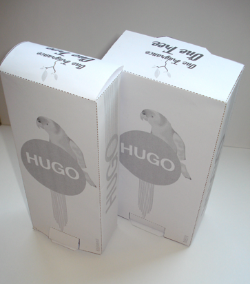
Also on the back of the box I want to add more trees to make it look more like a rainforest, this not only will look better but like i have just mentioned it will emphasis the fact that if you buy a fragrance then a tree will be planted in the forest.


These are the final layouts and compositins for the two fragrances, one being HUGO element and the other being HUGO man.
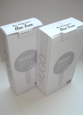

I had to change the template around slightly so that there was only an opening at the top at the back as it was ruining the details that I had to place on the front of the fragrance box.
When it came to printing i decided to print on to a quite ethical look to them , almost eco friendly.


 I thought about maybe placing the slogan 'one fragrance one tree' on the front of the packaging but i think it takes over and spoils the overall look of the packaging.


I decided to add a few more trees onto the back of the packaging to emphasis the look of a rainforest, it just fills it more appropriately and there is not as much blank space!
 I thought about maybe placing the slogan 'one fragrance one tree' on the front of the packaging but i think it takes over and spoils the overall look of the packaging.

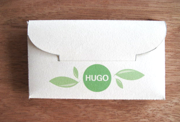
Original template that I started to play around with.