
Tuesday, 1 June 2010
Poster in placed in context
Poster for Hugo create placed in context, having it placed in the middle of the city will attract a lot of attention and make people aware of the launch of 'One Fragrance, One tree'.

Monday, 31 May 2010


Friday, 14 May 2010
Crit feedback...
When I had my crit a few people suggested I change the point size of my type here below to 10 pt to number 1 keep it consistent with the other type and 2 to make it more legible.

Tuesday, 27 April 2010
The Hugo Create Brief
Here I have photographed all the promotional work I have created for HUGO create altogether so that I can then go on to add it to my portfolio!I am really pleased with the outcome of this breif and it has really run smoothly. In reflection this brief definitely relates back to my specialist subject being type and image combined for commercial briefs and this exactly that! I have also considered stock through and this has really benefited my designs!

After crit feedback also I feel satisfied that I have pushed this brief to its full potential and feel that I can leave this one now and get on with my other briefs!

Friday, 9 April 2010
Bag design....
Here is my final produced bag,made to hold both fragrances that will be sold for the promotion 'one fragrance,one tree'. I carefully choose the stock which has really benefited my design and a lot of people have commented on how good it looks even though it is only printed on brown paper but that just shows how much of a difference changing the stock of paper makes if appropriate!

This design below was my initial design although it is quite simple and very samey to the packaging of the fragrances. This design would be printed onto the same stock at the bottle packaging or I would maybe experiment with printing onto brown paper. i thought that making the bag out of grass could potentially look really cool, it fits in with the whole ethical earthy, look after the environment feel and vibe that i am aiming for. I would print this design on to a brown stock of paper or brown paper to create a more earthy look and effect.
 I have had this photograph for a while and thought that I could maybe use it again for my packaging for my bag.
 These are the initial design plans for the bag that is going to hold the HUGO perfume box's, it is just another added promotional material that will help attract attention to the offer.

 i thought that making the bag out of grass could potentially look really cool, it fits in with the whole ethical earthy, look after the environment feel and vibe that i am aiming for. I would print this design on to a brown stock of paper or brown paper to create a more earthy look and effect.
 I have had this photograph for a while and thought that I could maybe use it again for my packaging for my bag.These are the initial design plans for the bag that is going to hold the HUGO perfume box's, it is just another added promotional material that will help attract attention to the offer.
I would like the handles of the bag to be made out of string so that it keeps with the ethical feel that is already existing.


Friday, 26 March 2010
Packaging design for the two HUGO fragrance bottles...
I have photographed my perfume box's to a professional level, although I am going to photograph these altogether in context.

These are the mock ups that I have made to make sure that all dimensions and measurements are correct before I make my final perfume box's... i am pleased with how they have turned out, there are just a few adjustments that I am going to need to change before I go ahead and print and make them. The adjusments are to remove the opening at the bottom of the box so that it looks neater, there doesnt need to be an opening at both the top and bottom so I just need to customize the template to my own.


These are the mock ups that I have made to make sure that all dimensions and measurements are correct before I make my final perfume box's... i am pleased with how they have turned out, there are just a few adjustments that I am going to need to change before I go ahead and print and make them. The adjusments are to remove the opening at the bottom of the box so that it looks neater, there doesnt need to be an opening at both the top and bottom so I just need to customize the template to my own.
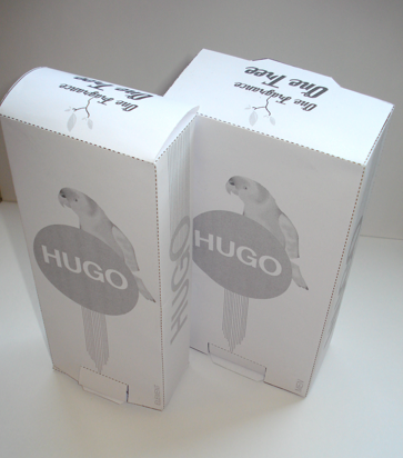
Also on the back of the box I want to add more trees to make it look more like a rainforest, this not only will look better but like i have just mentioned it will emphasis the fact that if you buy a fragrance then a tree will be planted in the forest.


These are the final layouts and compositins for the two fragrances, one being HUGO element and the other being HUGO man.
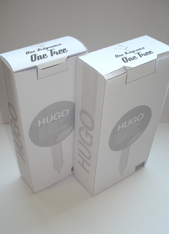

I had to change the template around slightly so that there was only an opening at the top at the back as it was ruining the details that I had to place on the front of the fragrance box.
When it came to printing i decided to print on to a quite ethical look to them , almost eco friendly.


 I thought about maybe placing the slogan 'one fragrance one tree' on the front of the packaging but i think it takes over and spoils the overall look of the packaging.


I decided to add a few more trees onto the back of the packaging to emphasis the look of a rainforest, it just fills it more appropriately and there is not as much blank space!
 I thought about maybe placing the slogan 'one fragrance one tree' on the front of the packaging but i think it takes over and spoils the overall look of the packaging.

Original template that I started to play around with.

Thursday, 25 March 2010
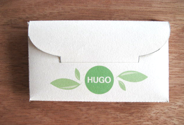
Packaging for code...
This is the final composition for the front and back of the code pack...


I then decided to start adding my information that was needed. The information that I have added in this mock up needs adjusting and developing a lot more but this is the initial stage.


I think I also may need to re consider the size that it needs to be if i want it to go in each of the perfume box's.


These two images below are the original mock up that i created to check that this template was right for what I needed. It will work perfectly to hold all my information.


This is the initial layouts for the packaging that is going to hold the promotional code in which consumers can locate their tree online. I have tried to keep it quite simple and use a limited colour palette. I am going to print it onto the same stock as I printed the poster for HUGO.

 Mock ups: These are the first little mock ups I created for the packaging, they are very rough but i think they are going to work perfectly the communicating the code idea.


I am thinking of maybe adding green foiling to the green circle on the front of the packaging to attract attention and bring a more proffessional quality to the work. I think it actually takes away the ethical feel to the design so I may not go ahead with it on my final pieces but it was good for an experiment and for development.

 Mock ups: These are the first little mock ups I created for the packaging, they are very rough but i think they are going to work perfectly the communicating the code idea.
These are a couple of layout sheets which I produced before going ahead and creating the art work for my packaging.
This was the original template i found in a template book that kicked off and started my ideas flowing for the packaging for this idea.
Subscribe to:
Comments (Atom)